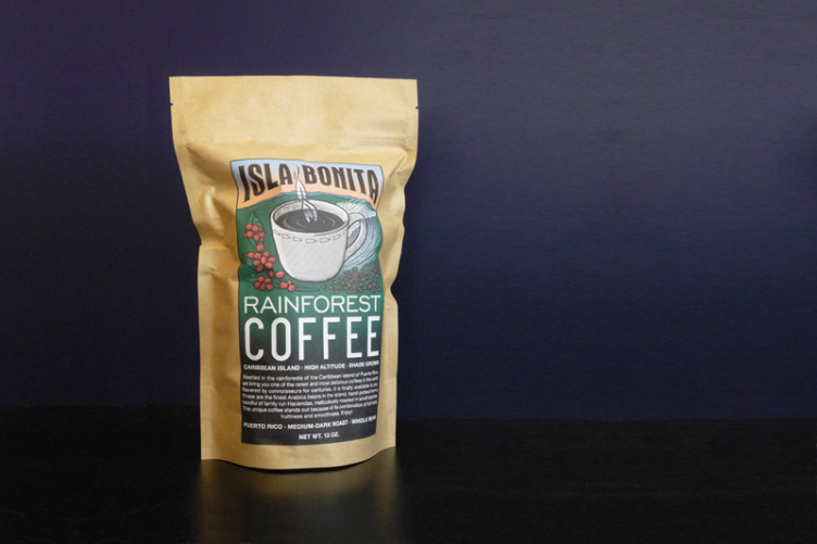
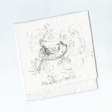
 Isla Bonita Coffee came in as a sketch from the client for “a logo”. After taking a look at their sketch, and upon talking with the client, we decided to go for a complete branding solution.
It’s a challenge to work on a new brand for a long-established and competitive product category, so we worked very systematically on this.
First, we considered words that would evoke what “Isla Bonita” wants to project: “Authenticity, Handcrafted, Premium Quality, Warm, Inviting, Approachable”. We then looked at images that we felt represented that.
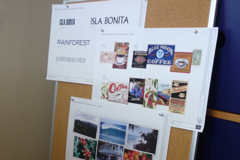
In the meantime, I started sketching and exploring the look of what would later become the packaging, as well as the typography.
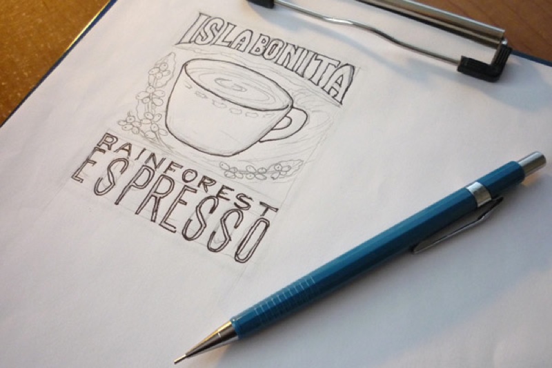
In the process of creating “the logo”, we helped the client define distinctions between the need for an actual logo, and the requested illustration which would become the product’s packaging.
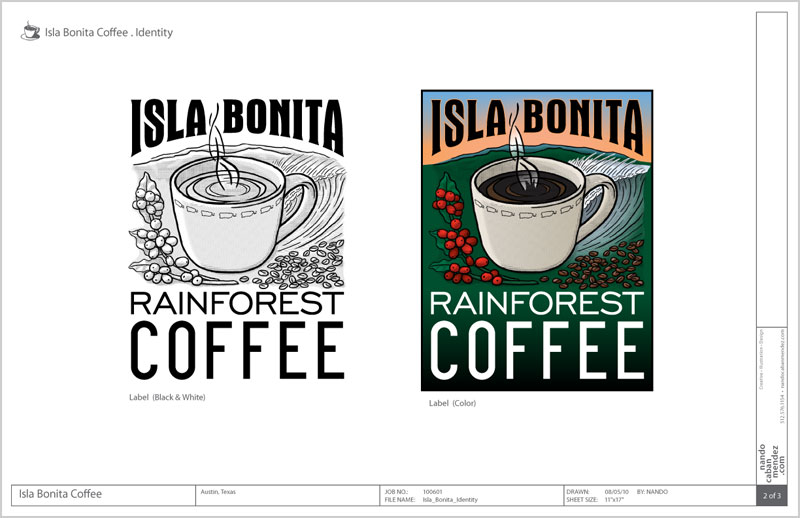
In a nod to the handcrafted, traditional methods used in farming this coffee, the style for this “label” mimics the wooden crate labels of early commercial farming. The colors, the “woodcut” appearance, custom typography, all speak of a small, warm and welcoming operation that just happens to produce a gourmet product.
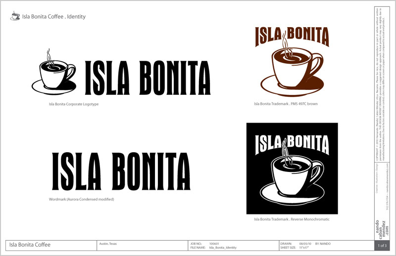
The Isla Bonita logo thus became a stylized version of the label illustration, akin to the evolution this “vintage” brand would have met as a second or third generation of owners had revised their identity.
Of course, we couldn’t do all that work and not wonder how it would look, so we made a mock-up of the packaged product.